Decision trees in GUI

In this blog entry I would like to discuss a bit about how to present user with a functional user interface when it comes about to showing a decision tree.

What is a decision tree?

Some of You probably have been buying a car. Or at least tried once or twice their on-line configurators. In such a configurator user is usually presented with a sequence of choices, like what color You like, what kind of engine and etc.

The questions are guiding user through the selection process one question after an another.

This is what I call a decision tree. I call it like that, because You can present it in a form of a graph which, in it’s most extreme case, will look like a full tree. Let me try to sketch it.

It is not a big tree, it shows just a few questions, so it can’t be big.

In fact it does not look like a tree at all. More like a bean pod or something. This is because the answers on three first questions are independent on each other. The color of a car does not have anything to do with a type of wheels. You can have low profile aluminum together with either black red or white. It does not matter, so the tree branches do collapse and join at the tree trunk.

However the third question opens a real piece of tree. After asking about the engine type we do ask about a battery size. Obviously all cars do have a battery, but the choice is very different. Electric car needs to have huge 10’000 amp hours or 50’000 amp hours (excuse me silly numbers, I just put them there randomly. I have no blind idea how large those batteries are). Gasoline needs smaller batteries so the choice is between 100Ah and 200Ah. Diesel needs a bit more so 200Ah and 300Ah.

Then the last question appears only on a diesel branch. Do You like to have a TDI? Yes or not? There is no point in even asking it for electric car or gasoline engine.

All right, so this is a decision tree. Now imagine You need to create a GUI for it. How will You do it?

Step-by-step, question after a question

This is a most common choice:

A plain dialog after a dialog, question after a question.

If You are nice then on each step You will show user a text area with an information about a previous choice.

For example like that:

This way You may guide Your user through a selection process, provide with images, help and explanations.

Of course You may also make it using some other form like tabs, enabled and disabled lists and etc. The key is that You are asking questions in a specific order. Once You reach the battery size question You simply select a right set. And You do not ask about TDI for anything but diesel.

When this is good idea?

Certainly when each question is used to direct user to do something. For an example if You do a digital camera support software You ask fist about what user likes to do, then what camera type he has and then are showing user how to connect it and at last what to download from it. There is no benefit in changing the order because You can’t download from a camera when it is not connected.

But with a car selector it is not a good choice.

When it is a bad idea?

Imagine a user who likes to select a car. Imagine, that this decision tree is a bit larger. Like, for an example, it has 20 questions or so. Once all questions are asked user is to be presented with a price and means to place an order.

All right, but what if user likes to check how much black car differs in price from a white. They can differ, right? But the question about a color was a first one asked!

Damn.

Your user needs to click back and re-do all the answers.

Of course You may remember them and suggest to user, but it is still 38 clicks away.

So maybe it will be much better to present it like that:

Tree as a dialog

I have again made some doodle. This is, as You can see, a dialog with some radio buttons. They can be radio button, check-boxes, drop downs and whatever. It doesn’t matter. The idea is that all choices are now visible. I even marked some selection with red dots.

The usual thinking about it is that user will make choices from top to bottom. The IFS EPDM team did that assumption. The LibreOffice team did. I recommend You to not make it. Instead assume that user can make any choice in any order and change it at any time.

For an example I might have first selected the battery size, then the engine type. This kind of dialog allows me to do that, right? This is the entire idea. I make a choice, dialog presents me with a price at a bottom. I like to try to make it black, so i check black and look at the price.

Nice, isn’t it?

Well… this also can be screwed up.

How to screw up that dialog.

Now imagine a user likes to try the electric engine. Like I draw on the left. But hey, electric engine can’t have 100Ah battery! This choice will be invalid!

What to do, oh what to do?

Blocking wrong choices

The first what comes to mind is to gray out invalid selections. In this case both diesel and electric will be grayed out due to battery. 10’000, 50’000 and 300Ah will be grayed out due to gasoline. And TDI, both answers, also.

And now imagine You are the user. And You try to figure out why the hell they are grayed out? In this simple example it is just a plain one-after another dependency. But the guys at LibreOffice in the “Image position” dialog are dealing with three levels deep dependency cascade. I needed a bug report, a long talk and half hour of trial and error to figure out how this dependency work.

So just blocking some choices may be frustrating to user.

What other choices do You have?

Correcting the user

In this approach You allow user to enter user a wrong choice but to not let prohibited selections You correct wrong ones to best, nearest selection. In this example when user selects “Electric” You test that 100Ah is a wrong selection and switch to closest equivalent. I have drawn it as a blue dot.

This way selection is fine and correct.

This is how IFS done it and how LibreOffice have done it. And I am mad on them, because I am loosing my time continuously due to that.

The tricky part is, that user may not notice that You made a correction. Especially when it happens far on the screen. This is not a big problem when a dialog is about You selecting a position of an image on a screen. But when instead of a nice, fashionable read car Your wife will get a black beast just because red was not good with some other distant selection You may get Yourself a not so nice divorce.

There is also an another problem with that approach. It is about non-reversible cycle.

When You make a correction You need to make a “nearest best choice” of some prohibited option. Now imagine I do click “Electric” and You select 10’000Ah because I selected smallest allowed battery size for “gasoline” so it is also best to select a smallest battery for “electric”. I am just looking on a price, so I am not even noticing it. I do then select a diesel, so you may choose from 200Ah and 300Ah. Again, logically, You do select a smallest one, that is 200Ah. Hmmph… it is still not a price I like. I like to try gasoline again and check an aluminum wheel. So I click “gasoline” and I frown. Why the price is 100 euros higher that the last time?

Obviously 200Ah is a valid choice for both “diesel” and “gasoline”, so there is no reason to correct it. But I have never ever clicked the 200Ah!

How to do it correctly?

I would be really happy if You would like to do it that way:

You will accept my selection. You will not change my wrong selections. Instead You will strike out or otherwise clearly mark it and all other invalid choices, gray out the “make an order” button and strike out a price with an explanation why it is wrong.

This way I can make I choice, see what is wrong and why, and then select what I like best. Surely this time if my wife gets a black car instead of fashionable red it is my true choice to make a divorce.

The Slic3r does something similar and I am happy with that.

That’s all for today.
How not to translate the user interface

i18n – internationalization

Today I would like to throw my stone in someone else garden, and this stone will be about translation of the user interface. Or to be more precise – how not to did.

Ok, what is all about?

No more than few days ago I have inspected some Qt GUI code with a line like that:

someObject->setText(tr("Close file"));

The tr() is a function which takes input text and translates it to selected language.

Excellent, isn’t it? Standard, good and readable. And if no translation is found it obviously falls back to English. Good.

Right?

Well…

Not so good.

Each language does have own specifics. In each language some words do have different meanings depending on where and how they are used. For an example in English “drive a nail” and “drive a car” are using the same word: “drive”. But in Polish it is: “wbić gwóźdź” and “prowadzić samochód”. You don’t have to know Polish to notice, that there is no common word in those two sentences.

Of course the tr() does not translate the text word-by-word. Instead it is a simple look-up table or a map which maps one text to another. So there is less space for confusion.

Despite of that it is still there. And You will have just one, single translation for all places where the sentence “Close file” is used in Your program.

It is all about a context

This is all about a context. Each text which is to be translated must be translated in a specific context. So I would recommend to do something like that:

someObject->setText(tr("SomeWindow::Close file"));

This way the tr() function is provided with an additional context: the “close file” text is used in “SomeWindow” class. Now if this text is used in an another window or an another context it may have a different translation.

This is relatively easy to make the tr() to use English translation as a fallback before it falls back to passed key. So it may return “Zamknij plik” or “Close file” or, finally if neither Polish nor English translation is present it will return “SomeWindow::Close file”. I agree that the last will be ugly, but it still can be understood by a human.

It is all about an ease of work

Second thing is the ease of actually performing the translation. Imagine You are a translator and imagine, You are provided with a file which is just a bunch of English sentences.

How can You correctly translate it?

Of course You can’t. You won’t take such a job. You would rather have the screenshots of GUI and write translations over it because then You will know the context.

Sadly supplying such screenshots to You is complex and expensive job. It will be also a bug prone when somebody else will be typing the translations into resource files. So You will rather be provided with a text file.

And now imagine this text file has some context information. It still will be bad. It still will be hard, but certainly Your translation may be better. And it will be easier (cheaper) to provide You with screenshots on which there is just an arrow pointing to a certain dialog and saying “this is SomeWindow”.

That’s all for today.

“Magic forms”, user friendly data computation “wizards”

Today I will try to show You something useful. A certain coding template. Yet I will not abuse Your intellect and I will NOT show You the code. It will be just an idea I used many, many years ago.

The task

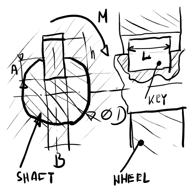
Now imagine You were given a following drawing:

A sketch of a shaft and a wheel with a "key" ("dado") and some dimensions.

This is a technical drawing of a joint with a “key” (I’m not sure the English word here, maybe it should be a “dado”), the shaft and the wheel. Basically a piece of metal is put inside a groove in the shaft and it is carrying the load and makes a wheel to spin. There are some dimensions, some material data like maximum pressure, some load like torque or force.

You are probably staring at it and do not understand anything about it. Well… that’s the life. You have to learn all the time. Anyway…

Imagine now that Your boss, I’m playing this role today, had simply told You: “Make a software wizard which will allow users to calculate parameters of this mechanical contraption.”

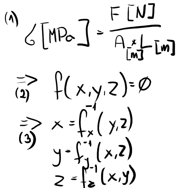
Obviously You will need some math. It will look like (1) on below doodle:

Some math equations for the shaft connection.

The (1) is the plain equation showing a pressure on the “key” as a function of it’s dimensions and load. Obviously there will be far more such equations even for this simple mechanism. But it should not bother us now.

Then there is an obvious question You will most probably ask:

What should I compute? What are input data and what are output values?

You may ask Your boss. If he is dumb, he will try to scratch his head and probably You will end up with a starting dialog in Your “wizard” looking like this:

Many companies did it that way. Autodesk did it and is still doing that for an example in their “spring” or “gear” wizards in Inventor suite. And You know what? I have to use it sometimes and I do curse it each time. There is never a proper choice on than drop-down list!

Obviously even for a single equation like (1) You will need far too many options on that drop down list (three that is) for it to be readable. For two equations You will get nine options. And so on, and so on.

As far as I remember from a tech school this simple shaft-key-wheel connection needs about six such simple equations. How many choices would You have to put on that drop down list to cover everything?

Not every possibility is a reasonable possibility

This will be probably Your second thought. Not every combination of known input data and unknown variables to solve is reasonable, so we can strip them off. This should let us cut down this drop down to, lets say….

STOP!

Don’t do that! This way of thinking is totally wrong. You may never guess for what purpose the “wizard” will be run. Sometimes people will be using it to design a new joint. Sometimes they will just try to figure out why the heck it broke and what was the maximum load? Sometimes they will just try to check what would happen if they would have changed the steel they used for a “key”?

You may figure out five or four reasonable combinations but You won’t be able to figure out all. And if You would, the drop down would take ages to read.

What to do, oh, what to do?

Let us go back to the basic question:

What should I compute? What are input data and what are output values?

This time I will be Your boss and my answer will be simple: “Everything and anything“.

Blah… I would even show You how it should look like:

It should be just a dialog in which user enter what he/she knows, leaving the unknowns empty, and the presses “SOLVE”. At that moment everything what is possible to solve should be filled with computed data. Everything what is not possible to solve should be left empty. And if something is in contradiction it should get stroke-out.

Gosh…. what a bastard I am.

You may pause at the moment and try to figure out by Yourself how to do it. And please, notice it CAN be done and even worse, it is EASY to do.

Have You finished? Then please continue reading to see how I did it.

Math knows everything

Let us look again at the equations:

This time look at (2). This is a plain, abstract function:

f(x,y,z)=0

This is how mathematicians like to present an abstract equation.

Obviously not every equation in this simple example will have such a form. Most probably some will have:

g(x,y,z,a)=0

or will depend on even more variables.

Now something important. In most cases (99% I think) You will be able to factor any equation binding any number of parameters into a set of three argument equations like:

g(x,y,z,a)=0
is the same as:
g1(x,y,A)=0
where A=g2(x,a,z)

by introducing some “hidden” variables.

We like three parameters equations, because we can easily solve them and present in a form:

f(x,y,z)=0
x=fx(y,z)
y=fy(x,z)
z=fz(y,x)

Obviously You can do it for four arguments too, but it is getting more and more complicated later.

What does it mean?

Simply: You can now compute any of x,y,z variables knowing two of the rest. Well… so simple and so dumb. What does it give us?

Stop looking now at the equation as at the match and start looking at it as a set of three variables. Each of those variables can be in two possible states:

  • “unknown”, value less, needs to be computed;
  • “known”, having value assigned to it.

Then look at the x=fx(y,z) as for a “rule” bound with three variables. This rule has a simple method:

condition apply()
{
 if (y is "known" and z is "known" and x is "unknown")
 {
    make x "known" and have value: fx( value of y, value of z)
    return "state-updated"
 }else
   return "state-not-updated"
}

Now simply imagine, that You do put them on two lists:

  • the list of “variables”;
  • the list of “rules”.

The key to success is to put all the rules on the list. That’s why I insisted on three variables form, because it is simple to do then.

All Your code need to do is then:

  • process the dialog input lines into variables. Set which should be set to “known”, make the others “unknown”;
  • loop through all the rules and call the “apply()”;
  • check if any of the rules returned “state-updated”? If yes loop again. If not finish computations.
  • update dialog with data from variables.

This simple algorithm bases on the idea that a variable can transit from “unknown” to “known” but not backwards. Thus the loop is bound to stabilize at certain number of “known” variables and viola! We have computed everything we could with a data supplied by a user!

Detecting contradictions

You may extend the state of variables to a set:

  • “unknown”
  • “known”
  • “known, but in contradiction”

And throw in the rule:

condition apply()
{
  if (all x,y and z are "known")
  {
      d = f (x,y,z)
      if (d is not in bounds )
      {
         make all x,y,z transit to state "known, but in contradiction"
         return "state-updated"
      }        
  }
  return "state-not-updated"
}

This rule will simply detect problematic variables so You can indicate it to user.

There is something however You should have noticed:

if d is not in bounds

In the ideal world, if x,y,z are correct then f(x,y,z)=0 so d==0. In a real world data are supplied with a finite accuracy and a floating point computations are also finite in accuracy. So in code the:

x = fx ( y, z)
assert( f(x,y,z)==0 )

will probably always report a problem. This is just something You should take in an account.

It is up to You to decide if to continue or not with the contradicted values. I would continue, because they won’t effect the base rule (“known”!=”known, but in contradiction”).

What else You can add to the “magic”?

I, as a a user will sometimes just fill some of the data. The algorithm may fill the rest, but then I may like to manipulate my own data. After this manipulation something may get contradicted. As an effect I may have to delete all the computed data to make an algorithm run again. This will annoy me.

You may then expand the states to:

  • “unknown, by user”
  • “known, by user”
  • “known, by computation”
  • “known, by retry”
  • “known, but in contradiction”
  • “unknown, by retry”

All data which are entered by user are getting the “known,by user”. All data which got to GUI from previous algorithm run are getting “known, by computation”. All empty are “unknown, by user”.

Then update code for computation:

condition apply()
{
 if (y and z are "known, by *" and z is "unknown, by *"
 {
    set x value to be equal to fx( value of y, value of z)
    if x was "unknown, by user" make it "known, by computation".
    if x was "unknown, by retry" make it "known, by retry".
    return "state-updated"
 }else
   return "state-not-updated"
}

and for contradictions.:

condition apply()
{
  if (all x,y and z are "known by *")
  {
      d = f (x,y,z)
      if (d is not in bounds )
      {
         for each variable  x, y, z
            if variable was "known, by user" make it "known, but in contradiction";
            if variable was "known, by retry" make it "known, but in contradiction";
            if variable was "known, by computation" make it "unknown, by retry".
         return "state-updated"
      }        
  }
  return "state-not-updated"
}

With this simple trick the user data will always take preference over computed data.

Obviously You need to show this difference to user and let him/her toggle the state. For an example a cursive may be used for computed data and some button may be added to make them “known, by user”.

Notice, there was a potential to “infinite looping” since contradiction would, essentially, toggle data back to “unknown” and open path to compute it again. That’s why I introduced that complex state scheme with “unknown, by retry” and etc. so that state transition could not cycle.

Possible problems?

The same as in all the math. Square equations. Sin^-1. And all which gives more than one solution. Gladly in 99% of cases You will have a “reasonable” rule to select them. Widths can’t be negative, angles cycle each spin around and etc. This “magic” is not a true “magic” and sometimes You may get stuck. Gladly You will see it when You will do the math, before even a single line of code is written so it won’t cost You much to step back and try an another method of showing that problem to a user.

Summary

I think You should now know how to design simple to use, powerful and easy to code “computation wizards”. Please use this idea wherever You like. I used it long, long time ago, and my users were extremely happy with it. Although it was surprising to them “how the heck it could solve every possible input combination?!

The trickiest part for users was to figure out why it could not compute some data. In such case a good help showing the math or tooltip showing what equation is used to compute the data or to detect contradiction is a must. Never forget about it.

Open source:Nice looking or functional?

This is very sad we have to ask such a question.

Should my program look nice or should it be functional?

If I would be to answer that I would always say “functional!” Functional! Functional!!!

The red painted hammer head looks better than a gray rough steel one, but the red paint gets chipped-of the first time You smash the nail. Yet a nicely painted red handle may look nice and does not harm the way the hammer works.

Take for an example GIMP and it’s default single color gray-on-gray icon scheme. Someone spent a lot of time making it. It may look nice if You like such a style. But it’s usability… It is really hard to tell apart an icon unless You are color blind, because in such case You are used to it. In most cases people do recognize things first by color then by shape. Red, roughly round – tomato. Round… hmmppph… Tomato? An apple?

Nice looking? Ugly looking? Fashionable?

Do not get me wrong. It is good to have a nice looking, easy on eyes program.

The key question is however: what does it mean: “nice looking?”.

I am a kinky person in all possible ways. The way I think, the things I like, the things which makes me hot. Do You think that what I find “nice” will be also “nice” for You?

As there is no universal beauty such there is no universal nice looking program.

The only path You may follow it is to make it “fashionable”. The fashion, as all we know, is changing rapidly. What is fashionable today won’t be fashionable tomorrow.

In my opinion this is a down-spiral to Your software death.

The question is: do You have a spare time to make it looking nice?

Yes, this is a key point. It may be not always true for open source community, because this community may have more people able to make things looking attractive than actually coding but in a commercial company it is always true.

Yet most commercial companies do go the path: “Let’s change UI in next version”. Really. I have spend few hundred hours to get a grip on Autodesk Inventor 2009 icon system. I got fluent in that. I just know without any searching where to click. And then in 2011 they have given me… a ribbon!

If anyone will try to tell me that ribbon is more efficient I’ll kill him! It is not! It is not a linear search structure. It is a zig-zag one with click in the middle. Not very bad if some icons do get grayed out when context does not allow to use them, but if they do disappear completely You are gone and lost. And WTF it is at the top of a wide but low screen?! In Word it almost turned my PC back to a single line Olivietti type-writer.

All right, next Autodesk Inventor version. 2019. A total rebuild of some context menus. Some new way of guessing what I would like to do. Well…

Not wrong right? User have a constant felling that something is really getting done. That the annual payment is not just a give-away.

Well…

There are bugs and future requests dating 2012 which are not implemented yet. They say they are “considering it”. Core functionality does not changed much. Many bugs I have in 2011 version on Windows XP are still present in 2019 version my coworkers have.

This is certainly a wrong path. Many hours of developers work lost on UI bells and whistles. Will it get better because they are get paid for doing upgrades? I don’t think so. I think they won’t do any important fixes. Why? Because we got into a vendor-lock-in and are neck deep in shit. We have 25 years of electronic documentation. And we are forced into a subscription model. Even if we would have completly opted out of the Autodesk we will still have to pay at least one subscription to just get an access to our old documents.

Each change has a price at user’s end

So we may say that software esthetics is not about “nice looking”. It is about “fashionable”. As long as You have free resources and You are doing a short living entertainment software this is a good idea to follow a fashion. Especially in a world in which information supplied to customers is so limited that they can’t make a reasonable decision and have to use hearts instead of brains to choose what to buy.

Be fashionable then.

But if You are making a work-horse software for people who are using it to get their living please consider it carefully.

Imagine You have a toolbar. Or even my hated ribbon. You arranged it in some or other fashion, good or bad. It doesn’t matter. You made some icons. Again, it doesn’t matter if they were good or bad. People just got used to that.

Time flown by, fashion changed. You decide to change those icons. Slightly re-arrange them. Maybe make them more fashionable, maybe make them more alike a color theme You company is using these days. This is not a hard work. If Your coders worked well it may be just a job for a hired artist. Change some bitmaps and run a build process.

Hmm… or maybe add something more? Making GUI is one of most popular programming tasks. Adding some fashionable stuff should not be expensive, You may hire some low cost coder to do that.

So You do it at a low cost.

Fashionable look may attract new customers, but how about the old client base You built for years? Possibly You may offer them an upgrade. Or even force it by making the old version unsupported now.

Regardless of how You do it Your new users will spend some time to learn how to use new features. They will have to learn how new icons look like, where old icons have moved and alike. Those changes are not big. They won’t impact their work much. You did not spent much money or time on it. Nobody is loosing anything, everyone is happy.

Not true. You old clients will spend much, much more. One hour times 10’000 users base. It is like about 55 people working and entire month just due to that change. Or a decent house in a country.

The question is: do You have a resources and time to make it functional?

This is a next question to ask.

The resources we are talking about are:

  • knowledge
  • people
  • time

I read once at LibreOffice developers forum that they have problems with fixing some core bugs because there is no more any person who really knows what is going on in the rendering system.

Then on Inkscape forum I read a post: “I tried it, it seems to work, I’m committing it” preceded by many question showing that there was a great problem to get a grip on what was going under a hood.

Considering my company and how many commercial paid products do change over time, or rather do not change, I think this is a quite popular condition in any kind of creative development.

Software is about creativity. I tend to think that designing software is a kind of complexity level as designing a country. Yet a person who was involved in it from the beginning can keep most of it in mind. Not details, but the key point and key concepts.

We had a situation in our company when a key programmer for a certain project got a brain stroke. He did return after a half of a year, but never regained his previous, full and brilliant mental powers. Since the project was kept mostly in his mind and was interlocked with many other projects we get a strong one year set back for an entire team.

The software, and especially “open source” idea came to life in between first and second generation of programmers. We all were young then. “Old programmer” was a word without a meaning. Young brains could remember a lot. Never felt a need to write things down, never felt to write down a concept. Code was self-explanatory to us then.

Today we do start dying. We do retire. We do work for living and are having no time and strength for doing coding at home.

The most valuable resource is people with a knowledge.

Back in about 2010 European Atomic Energy organization raised an alarm: “Qualified nuclear plants employees are dying out!” Well… not literally. Simply most of them were getting close to retirement age and it just appeared that there is no personnel to replace them. The governments screwed up, focused of technical aspect and forgot that knowledge==people. Poland does not have nuclear plant but we have a reactor running for medical and scientific purposes. The average age of an employee that time in that facility was close to 65. With most high qualified personnel about 75. The retirement age in Poland was at that time 65. So if all who could would have decided to retire we would end up with a reactor and a janitor to handle it. This is something You may call “an aggressive retirement”.

The solution was education. A pressure to hire more personnel than needed and get it educated by older personnel.

“Open source” is not free from that. It is even worse.

The nuclear energy is a highly regulated branch of industry. They have to have formal protocols for almost everything. They have to have perfect documentation for every technical detail. Logs. Data. Manuals. Instructions.

And they are continuously reviewed if those documents are up to date and in an agreement with a reality.

Do “open source” has such documents?

Summary

I do observe a continuous decline in software quality and continuous increment in it being “fashionable”.

I think it is a wrong path.

If “open source” community is seriously thinking about surviving it should focus on quality. Because a commercial companies will not ever focus on that. They are doing business and there are many, many better paths for gaining profit other than making a good product.

Open source is not about a profit. Open source is about a freedom of creation, but to exists it must have users. It can offer users an excellent, incomparable price, but it must be usable.

Is there then any point in following a fashion? Is then there any point of following paid software? Will a person who have no much money choose free, open source over paid subscription because open source looks more “fashionable”?

I do not think so.

Open source must focus on quality!

And in this specific case, I think, it means focusing on documenting the code.